


A-SAFE reveals evolution in brand identity
A-SAFE HAS unveiled a refresh of its long-established brand, as the UK-headquartered business continues to expand globally.
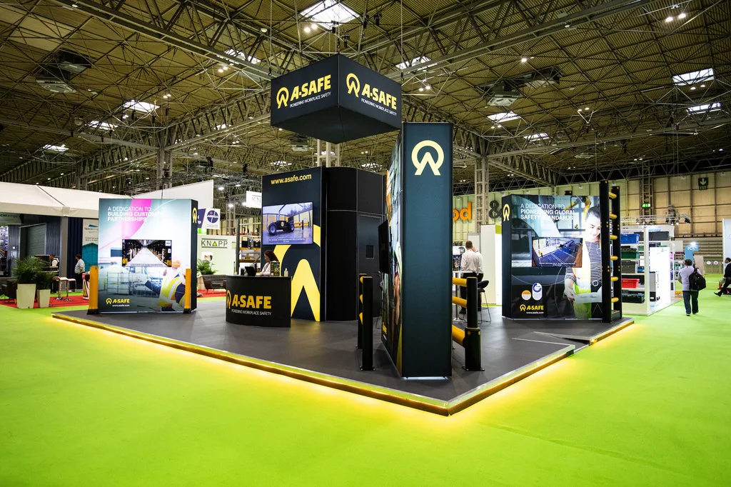
At the heart of the rebrand is a complete refresh of A-SAFE’s brand identity, with an evolved logo that builds on nearly 40 years of brand equity while setting out an ambitious stall for the business’s future. The new logo retains A-SAFE’s iconic black and yellow branding and distinctive typography, but introduces a new symbol that evolves the roundel to ensure it can be utilised in a wide-range of settings.
The rebrand also sees A-SAFE launch a new company strapline – Pioneering Workplace Safety.
One of the principal aims of the rebrand is to foster greater cohesion between A-SAFE and its global subsidiaries, alongside repositioning bands and units within the A-SAFE family, including research and development centre Fathom 3; testing facility Test By Design; Safeguru, the experts in personal protective equipment and, connected smart safety solutions specialist Conek.
A-SAFE co-founder and director James Smith, says: “Encompassing an enhanced logo, new brand promise and an exciting refresh of our corporate look and feel, this announcement firmly marks A-SAFE as a global business.”
For more information, visit www.asafe.com
Related posts